By: Raj Vardhman

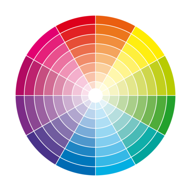
“Feeling blue”, “caught red-handed”, “black sheep”, “white lie” – the list goes on. Color plays such an integral role in the way we comprehend the world around us that it’s saturated our language and created a never-ending list of idioms. We use color not only to pinpoint a part of the visible spectrum but also to describe complex ideas such as emotions and character traits.
This is because, as color psychology explains, color greatly influences how we organize, identify and interpret sensory information in order to form an understanding of our environment. Although our perception of color is mostly subjective, some of its effects are universal.
Recognizing the importance of color and its impact on human thought and behavior, the marketing and branding sectors have long made use of the power of color in advertising and design. With the rise of the internet and the shift to online marketing and eCommerce, this reach has expanded to include web design.
Let’s explore the fascinating ways in which color, when used wisely, can be a powerful driver of conversion rate optimization with this knowledge packed color infographic.

Now that we’ve shown the scope of color’s influence on consumer behavior, here are some points to consider when putting color based website conversion tactics into practice:
- Identify your target audience – Is your product/service marketed primarily toward a particular demographic? Maybe you’re targeting men, women, children or perhaps customers from a certain part of the world? This is a major factor to consider when choosing a palette for your website. Numerous studies have narrowed down the preferred hues of different genders and age groups, taking some guesswork out of the selection process. Colors can also carry different meanings in different cultures. Pay attention to any regional color symbolism to avoid unintentionally alienating your target audience. The color purple for example, often a mark of royalty and wealth, has a starkly different meaning in Brazil and Thailand where it is considered the color of mourning!
- Don’t forget the brand – A website is a major component in your overall business strategy, but a component nonetheless. If you’re building a web presence for an already existing brand, the website’s color scheme will need to match the colors present in the logo and other visual identifiers. Alternatively, if you’re designing a website for a new business, take the opportunity to incorporate the web design into a broader branding strategy from the get-go.
- Make those CTA buttons stand out – Much has been said on the importance of call to action buttons, and as the infographic mentions, bright primary color are your friend in this case. Studies show a distinct correlation between call to action button visibility and rising conversion rates. The message is clear – utilize colors to boost visibility and differentiate CTAs from other elements of your website.
- When in doubt – test it out – At the end of the day, no amount of color psychology can give you an exact formula when choosing colors for your website. Narrow your choices down and then do some A/B testing to find out in practice what kind of design does and does not work for your audiences. Case studies show that this sort of testing can lead to some impressive conversion rate increases, such as this monumental 250% rise seen by Susty Party. It is important to remember that A/B testing is not a cookie cutter approach and changes that work on one website are not guaranteed to result in successful conversions in another. Thorough research is a must in order for A/B testing to fulfill its full potential as an incredibly useful web design tool.
- Don’t go overboard – It’s easy to get excited about all the ways in which different colors can be used as an asset in web design, but curb your enthusiasm! More isn’t always better. In fact, a popular rule of thumb in design is to try and stick to no more than three different colors, expanding your palette to different shades of the main three if necessary. Bear in mind that not all colors go well together and put thought into choosing the perfect color combination. Underestimating the value of white is another common mistake – it’s a great way to provide contrast, declutter and tie your design together. Use it!
- The more you know… – At this point, it should be glaringly obvious why, when it comes to designing a web presence for your business, color psychology plays such an impactful role. However, you might be wondering why a business owner should even concern themselves with the nitty-gritty of topics such as the use of color psychology in marketing, or ponder the aesthetic judgment of their website’s visitors. Isn’t that a web designer’s job? Absolutely, but arming yourself with a broad and comprehensive understanding of what a successful web presentation entails will allow you to aid in steering those in charge of creating one for you in the right direction. A web designer’s primary concern is creating a cohesive and visually appealing final product but as we’ve shown, color and other design elements are much more than that – they hold the key to successful conversions. Ultimately, no one understands your business better than yourself so it is in your best interest to be informed and educated in order to provide useful input during the design process and be able to more accurately judge the outcome.
- Choose the right designer for you – Ultimately, hiring the right people for the job is of the essence. Working with top web design companies means collaborating with a team of people who understand the broader implications of web design and are able to seamlessly combine visual appeal with high conversion rates. Aside from designing your website, these companies are often a one-stop shop providing web development, branding, logo design, digital strategy, and SEO services.
So there you have it, some helpful tips for harnessing the power of color psychology for your business. Now get out there and boost those conversion rates!


Leave a Reply