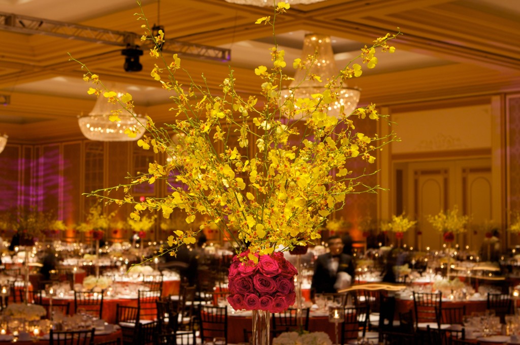
 by Karim Shivji, WPICC of The Wedding Guy in Toronto, ON
Color:
Color is the most powerful design elements. Color also has the power to alter your perception of a space, making walls appear to recede or advance. The way you perceive certain colors affects the way you feel in your space. Warm colors such as red, orange and yellow intensify emotions. While cool colors blues, greens and purples turn down the emotional intensity. What is color? As light strikes an object certain light wavelengths are absorbed and some are reflected. Red is the longest wavelength and blue is the shortest. White is the reflection of all wavelengths and black is the absence of color; the object absorbs all the light wavelengths. Whatever color scheme is decided upon, you must realize the source of light available in a particular space on the colors. There are literally millions of different colors created by the addition of white, called tints or the addition of black, called shades. You may have heard the words: value and chroma describing colors. Value of a color refers to the lightness or darkness of a color and chroma refers to the intensity or purity of a color. There are no colors that don’t go together, take a look at nature. The success or failure of combinations is due to the amount of color and the relationship to the design.
My favourite tool is the color wheel used by designers to create successful color schemes. The colors on the wheel are described as primary – red, blue and yellow are the pure hues that are mixed from any other color, placed equidistant on the color wheel. Secondary – orange, violet and green are mixed from equal amounts of primary colors. Tertiary – are the six colors produced by mixing a primary with its adjacent secondary color. Complementary – are colors directly opposite each other on the color wheel. Analogous – closely related colors on the color wheel. The most common color scheme color schemes include the just described along with Monotones, using a single color of a low chroma in one value. Neutral colors such as grey, make good background color and are easy to live with long period; however they tend to be dull and monotonous. Monochromatic is similar to monotones but using a wider range of chroma and value in a single color.
Light:
Light, as in color, is a powerful design tool. The type and amount vary the mood of a room. Most spaces incorporate natural and artificial light working together to light a room. Light is a creative medium, perhaps the most powerful of all mediums. As certain light is either reflected or absorbed by the different textural elements in a space. Natural light creates shadows and highlights objects; artificial light warms colors with a yellowish tone.
Texture:
Texture, like color stimulates emotion and provides two kinds of impact: visual and tactile. Every element in a room brings texture. Visual texture can be produced by paint to create various finishes on the walls, furniture, floor and accessories. Printed designs on fabrics or weaves of textiles also create visual appeal. Tactile texture such as velvet, raw silk, rugs, plasters walls, wood, glass and stainless steel stimulate your sense of touch. Texture affects the perception of color, as light reflects off or is absorbed by rough or smooth surfaces, the color changes dramatically.
Scale and Proportion:
Scale and proportion are the two defining principles behind the design of the space to bring a room together to form a whole. Scale relates to size of the room and object, which I have used very carefully in my space to avoid clutter and have room for movement. Think of traffic flow. Proportion pertains to the overall form of an object rather than to its size. I have also used proportion with scale which goes hand in hand to create a balance so that the client feels comfortable
Balance:
There are three forms of balance that apply to room design: symmetrical, asymmetrical and radial balance. Symmetrical balance is achieved by placing the identical type and size object on each side of a focal point. Asymmetrical balance is achieved in two ways. One is by arranging equal visual weights that are not identical equidistant from the centre of a focal point. Secondly, asymmetrical balance is achieved by placing unlike pieces at unequal distances from the focal point placing the visually large or heavier objects closer to the centre of the focal point. Radial balance is circular balancing of objects around a centre for instance a round table with the chairs surrounding the table evenly.
Harmony:
Harmony of a room depends on the relationship of the elements. When you repeat shapes, color, proportion and finishes in a room, harmony results. Harmonious proportions create a pleasing combination of elements that establishes a unified whole. Repeating the color scheme would be appealing to the eye.


Leave a Reply